
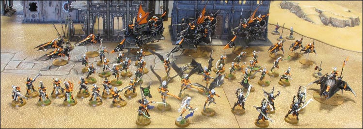
Phil: The sleek and sophisticated design of the Eldar has always appealed to me; ever since the revelations in WD127 made me a permanent Eldar fan all those years ago. Well, Jes and the lads have built on that aesthetic with the Dark Eldar range, leading to something much more sinister and predatory. The warriors and war engines of Commorragh look truly wicked, in both the biblical and the 90's gangster sense of the word. To me, the Dark Eldar army is the most lethal-looking force of the 41st Millennium, bar none.
So why the virulent orange and black colour scheme? Well, part of it is because of the notion of poison and danger - nature uses strong colours to tell would-be predators to stay away, and I like to think the glossy orange and black scheme conjures up echoes of poisonous beasties such as gila monsters (Google them, they're ace) and Amazonian tree frogs - perhaps the most poisonous critters in the world.
It is also supposed to be reminiscent of the colours of underground clubs and subcultures, 'cybergoths' to be precise; there's something about sombre black combined with bright UV colours such as bright orange and acid green that provides a great contrast. I love the idea that the Dark Eldar don't really wear uniforms, it's more about what's in style during that season - Duke Sliscus's 'poison chic' being the operative style here. Military organisation be damned; for these alien fashionistas the important thing is to look good when you're killing.


